Branding for artists - a sneak peek of my new visual identity
- 59 Perlen
- Dec 2, 2020
- 5 min read

Today I want to talk about branding, the process behind and I want to give you a sneak peek of a new visual identity for 59 Perlen which will launch soon. I decided to publish these insights, as other artists struggle a lot with this topic, and they might find my learnings useful for their own process.
Why is artist branding so important?
The years end is coming closer and closer and I still have some very cool releases in the pipes. But in 2021, I'm going to start a new chapter of 59 Perlen with a revamped branding.
Why is this so important? Well. Mostly of 2 reasons.
First, there are literally millions of music producers out there. Music creation got incredibly affordable and everyone who wants to create, can do this in no time. That means, you need to differ in what you do but also in what you look alike and that's where branding and visual identity comes into the game.
The second reason is, it can be an extension of an artists' musical journey and visual identity can adopt the mood of the music on a visual level, which supports reason no. 1 of course.
But branding is not easy, especially making one for yourself. But which bedroom producer can afford a design agency? To get a proper result, you need to know who you are, what you stand for and what you want to tell your fans and audience. Imagine AC/DC using a pink, soft blurred handwritten type letter - fans wouldn't recognize the band's identity, which is not soft, it's hard. You get the idea.
Collecting ideas and opinions
So, to start, I collected ideas and opinions and made a "Mood board" from it. The picture above gives you a first impression of this visual process. I wanted to create an identity that reflects not only my (new) musical direction, but also 59 Perlen as a person.
Until now, I struggled a lot to find a visual language that can serve these desires. Not only because I think it's hard to develop a design for yourself. I also found it difficult because I didn't know exactly about the musical direction of 59 Perlen. And that's integral to know as the visual appearance of an artist should reflect and represent his music.
Defining the design foundation
Now, my latest releases and works have been very interesting to me. I got a lot of valuable feedbacks and comments about quality, style, and sound. With the help of this, I clearly figured out the soul and the characteristics that makes 59 Perlen what it is. I finally found my niche, a signature sound and a genre (which I was always struggling with). Things I was searching for a long time, but I couldn’t find answers.
Since I took the dawless way and left the computer behind, it got clearer and clearer that this way of generating music will shape the path of 59 Perlen’s future and the time has come to give this path a proper appearance, expressing what my music and also me is about: warmness, cozy, incorrect, feeling good, minimalistic, calm.
59 Perlen is not uplifting music, it won't be played in a club and it's nothing that gets your heartbeat up. It's music for waking up, for a cozy coffee with friends in the afternoon, for calming down or for getting ready to go out and party.
These values are the foundation of the revamped 59 Perlen design.
Dividing the brand in smaller parts
What you see above is the "mood" that I want to transport, the essence of the vibes that my music gives to the listener.
Before developing something new, I decided to keep some elements that are already there. There is the logo, for instance, with the circle standing for the "Pearl" of the artist name. I absolutely love its simplicity, and thus I wanted to keep it together with the font that I already use and like a lot. I will use it in 2 different faces, a bold one and a lighter one.
Key elements of the visual identity
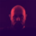
Another element - and one that was strongly missing in the past - is a new color palette with a set of 6 colors. It has a pretty bright red and some warm contrast colors with yellow components. They reflect the core values I explained earlier - coffee, cozy curtains, also some mystic atmospheres. Most images and graphics in the identity will be using one of these colors or combinations of them (like the duotone image above).
I also put some time into a new concept of picture motifs. What do I want to show followers and fans? When I browse my Instagram page, I don't see continuity, I rather used the readymade Insta filters to create a "Lo-Fi" feeling across posts. But I was never happy with it, and the stream shows it perfectly. This applies for other channels as well, and that's where I want to work on. I've defined a selection of motifs that I going to use across channels, and these are all connected to my music as well: textures, duotone images, gear, me as a person, and so on.
There are numerous applications that an artist needs to serve nowadays, the list is endless: Artworks, Website images, Press pictures, Social Media, Profile Pictures, Header Graphics. All these images will be connected through the defined visual language, and to reach that bespoken continuity, I created a simple rule: each image that's published must at least reflect one of the core principles of the design (color, font, motif selection, graphics, logo).
There might be images that won't match these principles. For instance, labels often use a template for their artworks and that won't match the CD. In this case, I will create a gallery post with the original artwork and one that has a relation to it and that matches the design requirements. Sounds complicated but is simple.
How to implement this CD with mobile equipment
Now, I'm a very mobile guy and I create most of my Social Media posts straight on my phone on the go. So, it was clear from the beginning, that the complete design must be simple to implement on my phone. I installed my font faces on my mobile and saved the color palette as a reference image.
Then I created a couple of templates in my picture editing software which is "Canvas". I also installed an app for creating duotone images called "Tingle", my video editor on the go is "Luma Fusion" which I created a template for as well.
The next steps
Now I "just" need to implement these principles :) It will take some time and will be a constant process, my goal is to be completely ready with the first 2021 release in January.
I hope, these little insights are interesting or helpful for you. I'm not a branding expert, I just follow my experience and I think this will be a language that will represent my music perfectly!
I have never been so clear about the values of this project as I am now, thanks to my fans who have given me valuable feedback on my videos on YouTube and Instagram. Thanks a lot for that, I really appreciate your thoughts and ideas and I really can’t wait to show you what I’m working on right now (both visually and musically).